Drawing Box Plots
The box plot is useful for comparing the quartiles and variation of quantitative variables. In a box plot, lower and upper ends of a box (the hinges) are the first (Q1) and third quartile (Q3), and the middle horizontal line represents the median (Q2) of the data. Outliers of the data are shown by the whiskers of the boxes, when data falls above 1.5 * IQR, where the inter-quartile range IQR = Q3 - Q1.
Drawing box plots using R
To Understand the different visualization cases, we will use the monthly dengue counts in Sri Lanka for 2017. The data set is saved in Google Drive as a Google sheet.
library(gsheet)
df=gsheet2tbl('docs.google.com/spreadsheets/d/11JspFL9bz6jEiaPw7ih0cllfVla4VYFyeSyH-EG0J2g')
data=df[,2:13]
head(data)
## # A tibble: 6 x 12
## Jan Feb Mar Apr May Jun Jul Aug Sep Oct Nov Dec
## <dbl> <dbl> <dbl> <dbl> <dbl> <dbl> <dbl> <dbl> <dbl> <dbl> <dbl> <dbl>
## 1 2734 1900 2467 2570 3333 5372 7471 3620 1251 823 1131 1602
## 2 1635 1087 1870 2072 3168 4901 9039 3553 1246 779 1078 1219
## 3 581 448 836 739 946 1248 2612 1477 663 337 528 546
## 4 252 207 369 443 862 2314 3855 2354 1090 821 884 957
## 5 129 103 145 120 165 436 766 534 167 177 214 215
## 6 50 32 42 37 57 94 294 159 39 27 22 39boxplot(data, ylab ="Dengue Counts", xlab ="Month")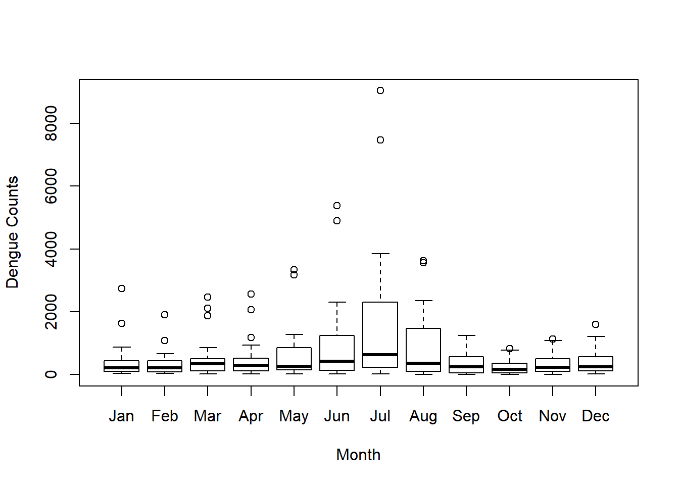
According to the figure, we can see that there is an increasing trend from May to July, and then it decreases. Overall the dengue counts are high from May to September with compared to the other months. This period is the south-West monsoon period which is from mid May to September in Sri Lanka.
Now if you need the variable names vertically, instead of horizontally, use las option, and we add a legend by using pch=20 to the plot. Further we reduce the font size by using cex option. Note that the default cex value is 1.
x.labels=c("Jan","Feb","Mar","Apr","May","Jun","Jul","Aug","Sep","Oct","Nov","Dec")
boxplot(data, ylab ="Dengue Counts", xlab ="Month", las = 2)
legend("topright", legend = c(unique(x.labels)), pch = 20,cex=0.8)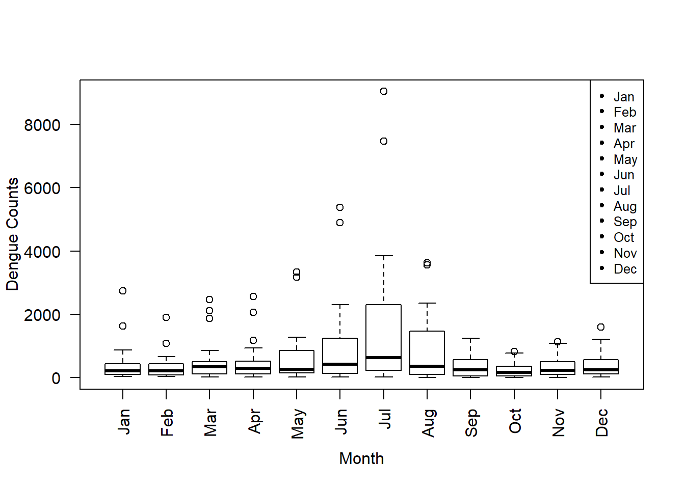
If you want to change the variable names use the option names:
boxplot(data, ylab ="Dengue Counts", xlab ="Month", las = 2, names = c("January","Febrary","March","April","May","June","July","August","September","October","November","December"))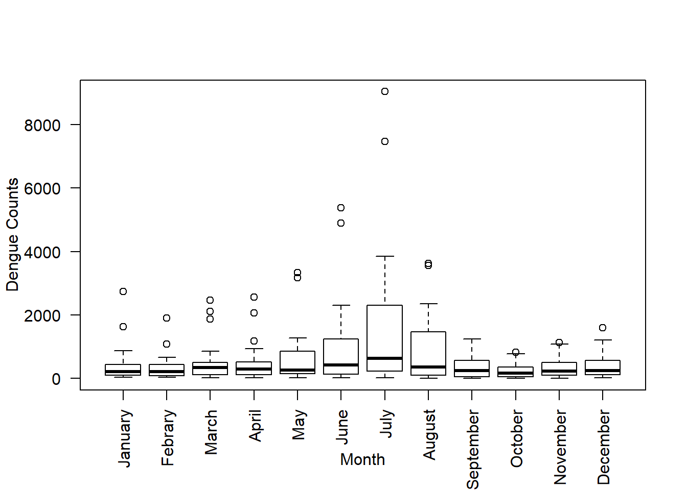 If the names are too long and they do not fit into the plot’s window you can increase it by using the option
 par:
boxplot(data, ylab ="Dengue Counts", xlab ="Month", las = 2, par(mar = c(12, 5, 4, 2)+ 0.1), names = c("January","Febrary","March","April","May","June","July","August","September","October","November","December"))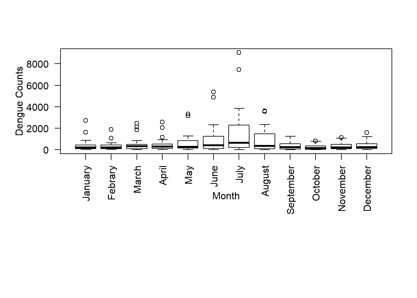 There is a seasonal variation of Dengue counts. Four seasonal periods are identified in Sri Lanka on the basis of the two monsoons and two transitional periods. They are the North-East monsoon from December to February, First inter-monsoon from March to mid May, South-West monsoon from mid May to September and Second inter-monsoon from October to November.
Now, I will group January and February in one group, March to May to the second group, June to September to the third group, October to November to the fourth group , and December seperately. To do this, specify the position, along the X axis, of each box-plot. Then, the first 2 box-plots at position x=1, and x=2, then leave a space between the second and fourth place and start the next at x=4, and so on.
boxplot(data, ylab ="Dengue Counts", xlab ="Month", las = 2, at =c(1,2, 4,5,6, 8,9,10,11, 13,14, 16), par(mar = c(12, 5, 4, 2)+ 0.1), names = c("January","Febrary","March","April","May","June","July","August","September","October","November","December"))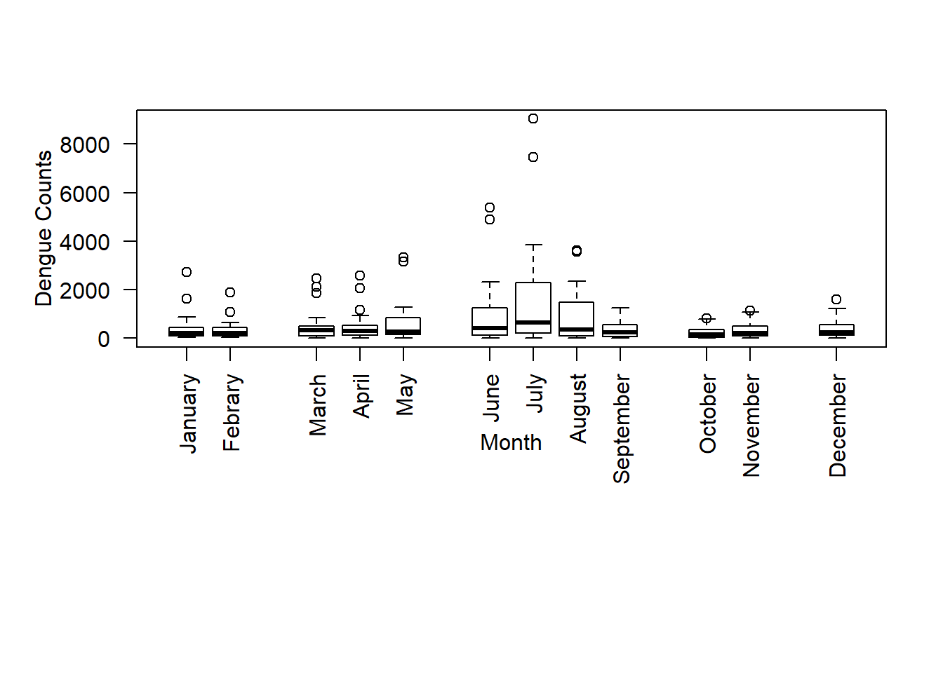
Now, we add colours to box plots by using the option col, and specify a vector with the colour numbers or the colour names. You can find the colour numbers here, and the colour names here.
boxplot(data, ylab ="Dengue Counts", xlab ="Month", las = 2, col =c("red","sienna","palevioletred1","royalblue2","red","sienna","palevioletred1",
"royalblue2","red","sienna","palevioletred1","royalblue2"),
at =c(1,2, 4,5,6, 8,9,10,11, 13,14, 16), par(mar = c(12, 5, 4, 2)+ 0.1), names = c("January","Febrary","March","April","May","June","July","August","September","October","November","December"))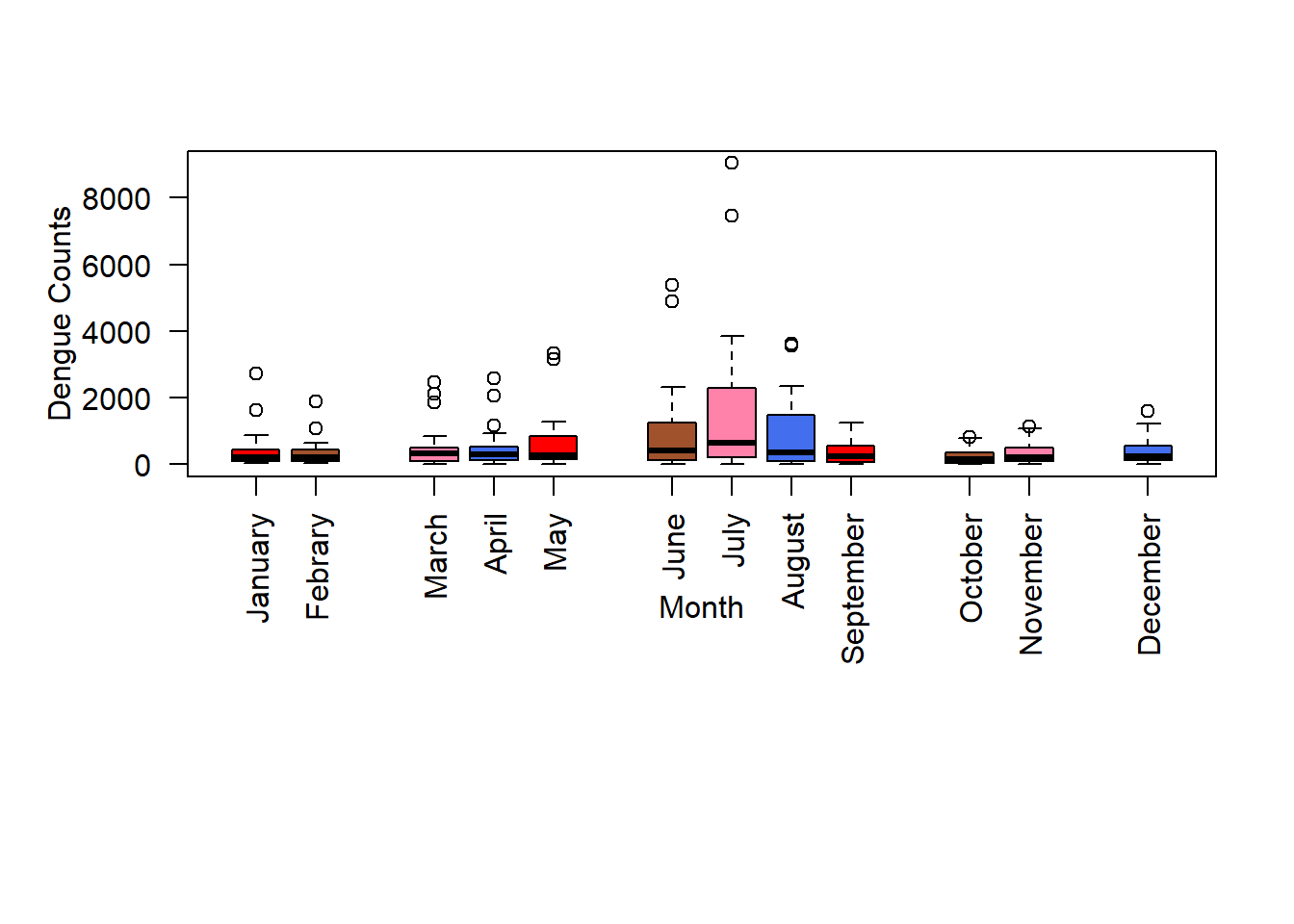
Drawing box plots using plotly package
Using plotly package we can draw publication quality graphs. More details of drawing box plots using this package are given in this website.
Now we use monthly dengue counts in Colombo district from year 2010 to 2017 to draw box plots.
library(gsheet)
df=gsheet2tbl('docs.google.com/spreadsheets/d/1KsgRDiGPitkW3l8WAOzijBXfFlPIx8a2RCm538nCLik')
df=df[,1:4]
suppressMessages(library(dplyr))
head(df)
## # A tibble: 6 x 4
## year month district count
## <dbl> <chr> <chr> <dbl>
## 1 2010 Jan Colombo 584
## 2 2010 Feb Colombo 606
## 3 2010 Mar Colombo 294
## 4 2010 Apr Colombo 224
## 5 2010 May Colombo 296
## 6 2010 Jun Colombo 700# To apply the given codes the data should be in the same format.
library(plotly)
month <- c("Jan", "Feb", "Mar", "Apr","May", "Jun", "Jul", "Aug","Sep", "Oct", "Nov", "Dec")
# Months in january to December format use xform and then add layout
xform <- list(categoryorder = "array",
categoryarray = c("Jan", "Feb", "Mar", "Apr","May", "Jun", "Jul", "Aug","Sep", "Oct", "Nov", "Dec"))
p1 <- plot_ly(df, y = ~count, color = ~month, type = "box")%>%
layout(title='Monthly Dengue incidence cases from year 2010 to 2017 in Colombo District', xaxis = xform, yaxis = list(title = "Dengue Count"))
p1Now we draw box plots for year-wise dengue counts in Colombo district from 2010 to 2017 .
#Transform year variable as a factor variable
df$year=as.factor(df$year)
suppressMessages(library(dplyr))
library(plotly)
p2 <- plot_ly(df, y = ~count, color = ~year, type = "box")%>%
layout(title='Dengue incidence cases from year 2010 to 2017 in Colombo  District')
p2
Drawing box plots using ggplot2 package
The package ggplot2 also gives publication quality graphics. Here, we have to provide three different fundamental parts to the plot, i.e.
Plot = data + Aesthetics + Geometry.
A very good tutorial for drawing box plts using this package is given in this website. Another one that I usually refer is STHDA
Top 50 ggplot visualizations are shown here.
Again we use monthly dengue counts in Colombo district from year 2010 to 2017 to draw box plots.
library(ggplot2)
theme_set(theme_bw())
# Months to create January to December format in ggplot then add layout
df$month<-factor(month.name,levels=month.name)
library(reshape2)
df.long<-melt(df,id.vars="month")
p3=ggplot(df, aes(x = month, y = count, color=month)) +
    geom_boxplot() +
    labs(title="Monthly Dengue counts for year 2010-2017",
         subtitle="Colombo district, Sri Lanka",
       y="Dengue Count",
       x="Month",
       caption="Source: Epidemiology Unit, Ministry of Health, Sri Lanka") +
  theme(axis.text.x = element_text(angle=90, vjust=0.2))
p3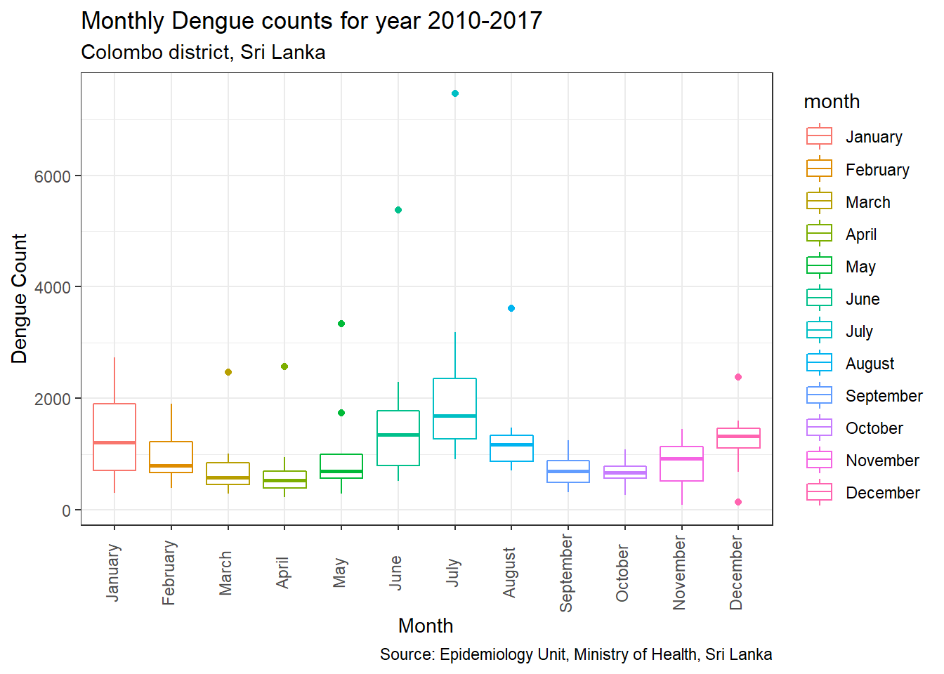
# You can rotate the box plot
p3 + coord_flip()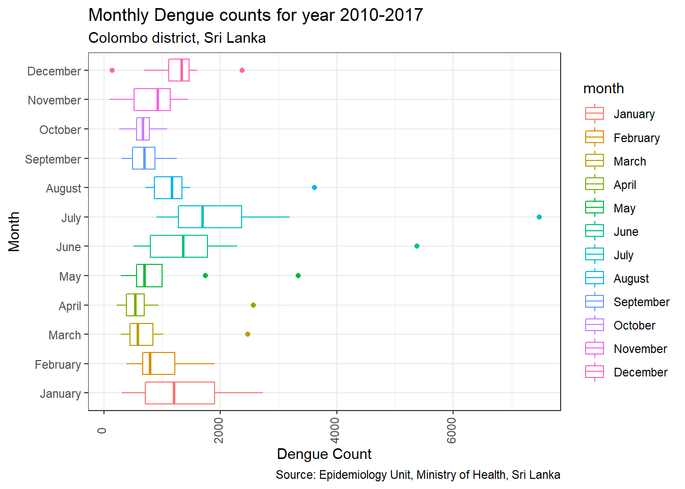
Drawing box plot by showing all observations
To view all observations together with the box plot, use the functions geom_dotplot() or geom_jitter(). We can draw this either by adding dot plots or jittered points as below:
library(ggplot2)
p3=ggplot(df, aes(x = month, y = count, color=month)) +
    geom_boxplot() +
    labs(title="Monthly Dengue counts for year 2010-2017",
         subtitle="Colombo district, Sri Lanka",
       y="Dengue Count",
       x="Month",
       caption="Source: Epidemiology Unit, Ministry of Health, Sri Lanka") +
  theme(axis.text.x = element_text(angle=65, vjust=0.6))
# Box plot with dot plot
p3 + geom_dotplot(binaxis='y', stackdir='center', dotsize=0.5)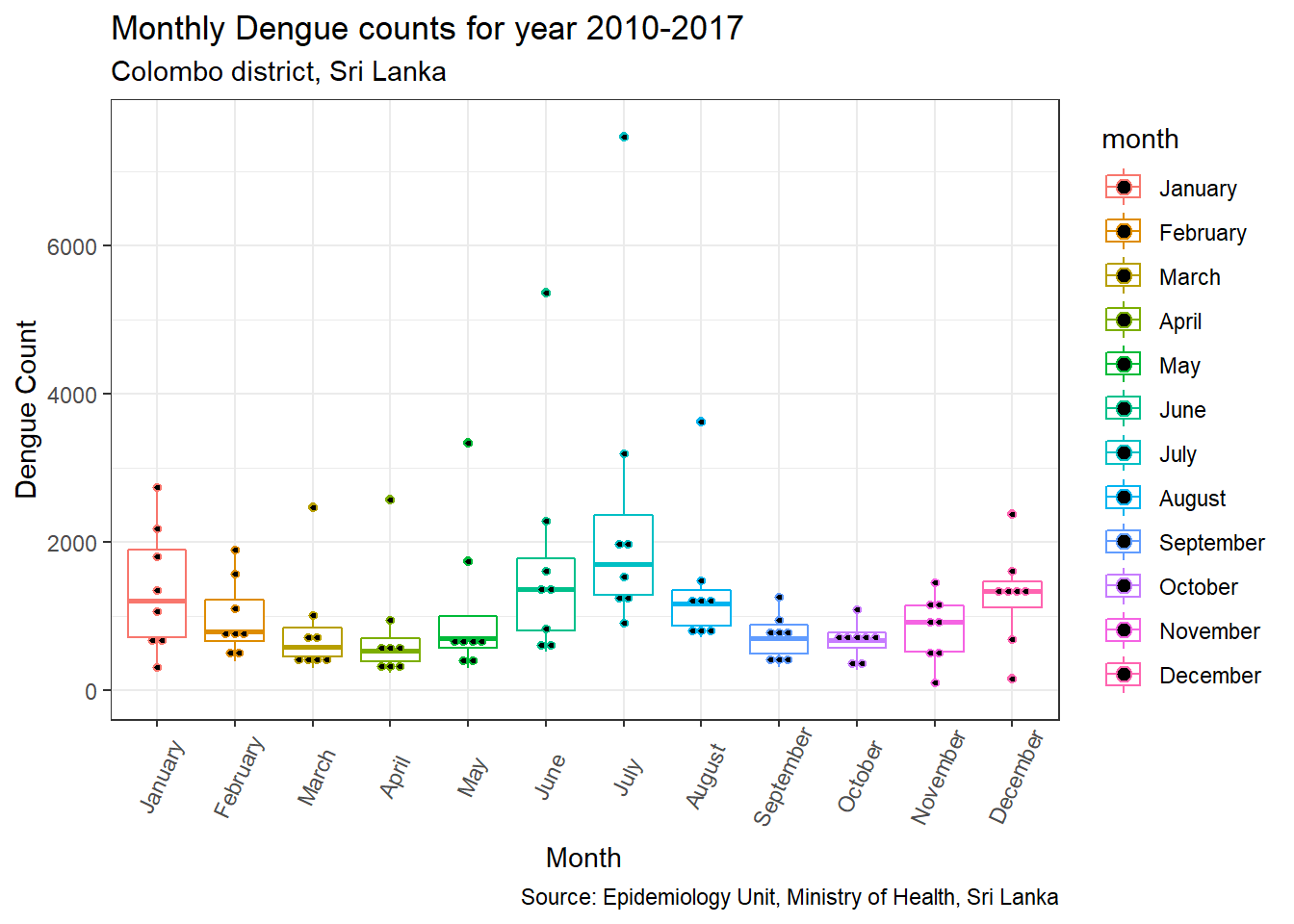
# Box plot with jittered points
# 0.2 : degree of jitter in x direction
p3 + geom_jitter(shape=16, position=position_jitter(0.2))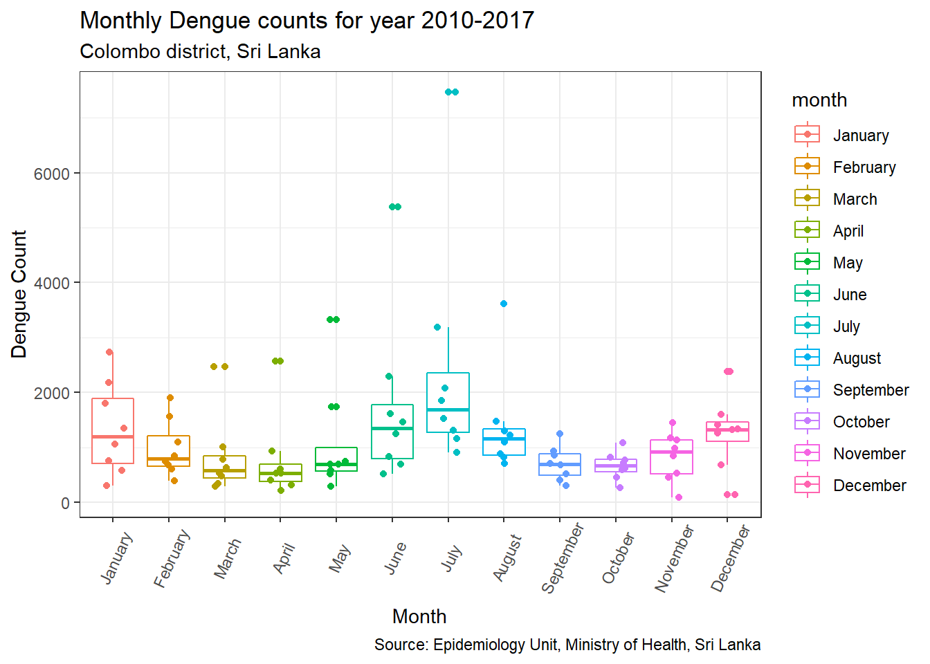
This plot helps us to determine whether the sample size is sufficient. In this case, total Dengue count for each month from 2010 to 2018 was presented. Therefore for each month only 8 observations (n=8) are availble. Since some outliers are present for March to June, August and December, a question would be whether the variability shown is inherent to the data or a result of the small sample size (n = 8).
Note that we can combine a box plot with a beeswarm plot using the beeswarm package to optimize the locations of the points. The beeswarm plot is a one-dimensional scatter plot which displays individual measurements as points.
library(beeswarm)
boxplot(count ~ month, data = df, las = 2, main = "Boxplot with beeswarm for Dengue counts of Colombo district from 2010-2017",
       outline = FALSE)
beeswarm(count ~ month, data = df,
    main = "Beeswarm of Dengue counts versus Month", add = TRUE,
    pwcol = as.numeric(year), pch = 16)
legend("topright", legend = levels(df$year),
       title = "Year", pch = 20, cex=0.5, col = 1:3)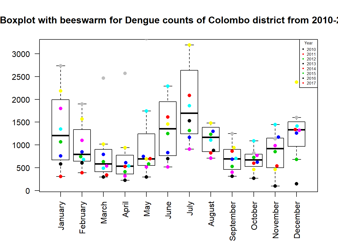
The plot shows how each year the dengue counts vary in Colombo district.
Violin plot to combine a box plot with a density plot
For density estimation, a sufficient number of data should be available for obtaining reliable estimates.
suppressMessages(library(ggplot2))
require(gridExtra)
## Loading required package: gridExtra##
## Attaching package: 'gridExtra'## The following object is masked from 'package:dplyr':
##
## combinep.violin <- ggplot(df, aes(x = month, y = count, color=month, fill=month)) +
# add horizontal lines for Quartiles at Q1, Q2, and Q3
geom_violin(draw_quantiles = c(0.25, 0.5, 0.75)) +
labs(title="Monthly Dengue counts for year 2010-2017",
subtitle="Colombo district, Sri Lanka",
y="Dengue Count",
x="Month",
caption="Source: Epidemiology Unit, Ministry of Health, Sri Lanka") +
theme(axis.text.x = element_text(angle=65, vjust=0.6))
p.violin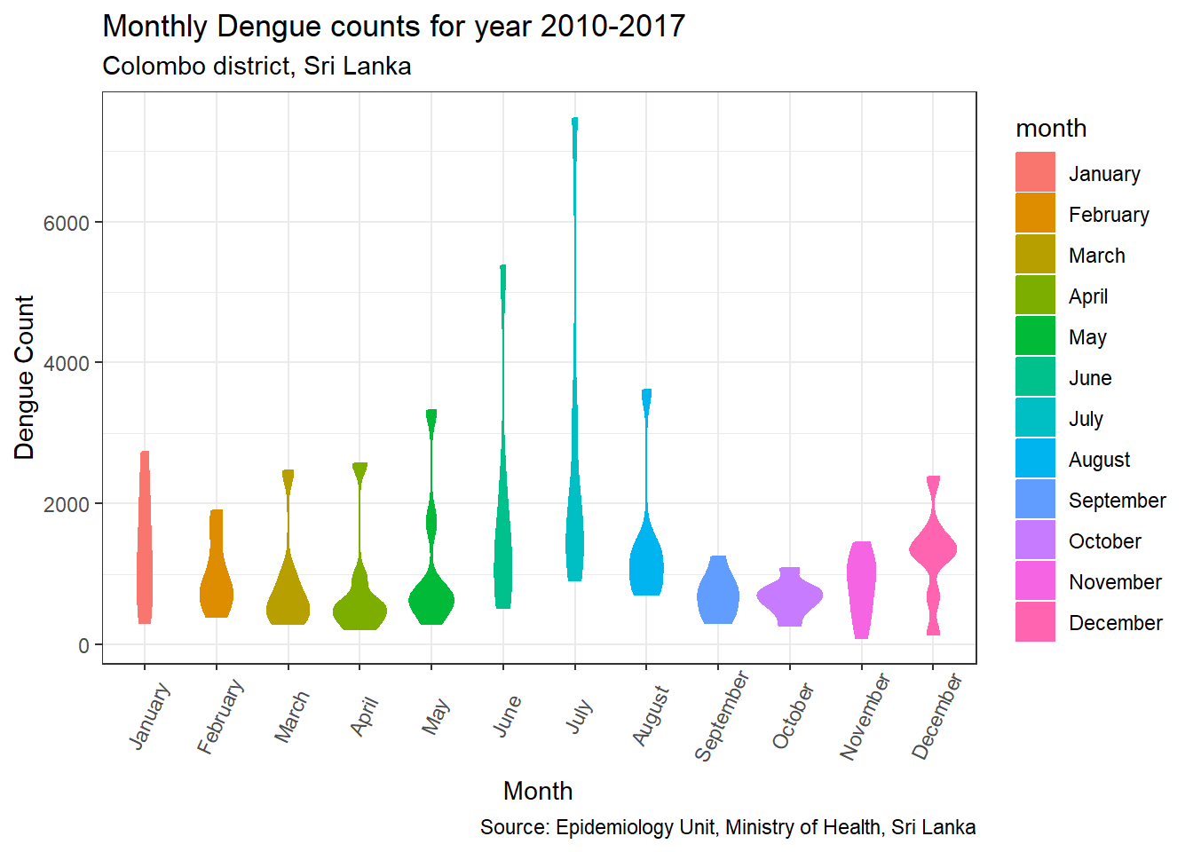
From three lines shown in the plots, middle line indicates median of data. Based on this line we can understand how 50% bove and below the data vary. Note that the violin plot stretches up to the outliers for months from March to August. From the boxplot we can easily identify these outliers.