Principal Component Analysis
In some statistical techniques, it is essential to convert a set of correlated variables to a set of uncorrelated variables. This can be done by using Principal Component Analysis (PCA). The converted uncorrelated variables are called principal components that represent most of the information in the original set of variables.
This statistical technique is also a useful descriptive tool to examine your data, and to reduce the number of variables of the original data set.
To obtain Principal components we can either use the covariance matrix of the data set or the correlation matrix of the data set. If the variances of the variables are significantly different, we can use the correlation matrix, and use of correlation matrix also implies that we consider standardized variables for the analysis.
When finding principal components, we try to find linear combinations of a set of variables that maximize the variation contained within them and displaying them using fewer dimensions. More details of this method can be learned from this ebook
Example
Consider an example in which yields of 8 varieties of oat gathered from two experimental stations located in the north-eastern region of Poland (Dmowski et al. 1989).The oat varieties considered in this study are:
A- Markus(V1), B - Perona(V2), C - Borek(V3), D - Rumak(V4), E - Dragon(V5), F - Boruta(V6), G - UÃlan(V7), H - PÃlatek(V8).
The locations of the experimental stations were ‘Wrocikowo’, and ‘Garbno’.
Now we read the data set. Suppose your data set is a .csv file saved in your working directory. Using dplyr package you can present this data set in table form in your output document. The rows in this data set correspond to the locations and the columns represents varieties. Now, we read the data, show first 5 lines of the data, and check the variable names using the following codes.
suppressMessages(library(dplyr))
oat_data <- read.csv("oat.csv")
head(oat_data)
## location A B C D E F G H
## 1 Wrocikowo 39.4 36.9 37.4 40.8 43.0 40.9 38.1 37.5
## 2 Wrocikowo 41.6 40.3 40.2 46.9 42.9 42.4 42.7 40.5
## 3 Wrocikowo 44.0 43.7 45.6 45.3 48.2 45.0 44.2 42.2
## 4 Wrocikowo 53.4 55.9 54.7 55.3 57.1 58.6 57.2 55.3
## 5 Wrocikowo 45.5 44.2 41.1 45.4 46.5 46.4 45.0 39.6
## 6 Wrocikowo 37.6 38.8 35.7 35.8 38.6 38.9 39.1 38.8names(oat_data)## [1] "location" "A" "B" "C" "D" "E"
## [7] "F" "G" "H"Now without considering the variable ‘location’, we can compare the yields of 8 varieties using the boxplots as below:
#Select the last 8 columns
oat_data2=oat_data[,2:9]
boxplot(oat_data2)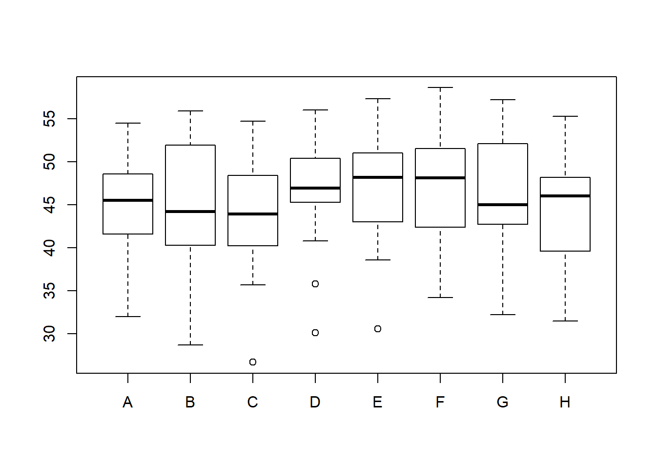
Note the differences between the yields of 8 varieties. The varieties C, D, and E contain some outliers.
Now we find summary statistics, covariances and correlations of 8 varieties. We usually do this to check whether we have to use the covariance or correlation matrix to obtain the principal components. Also, to check whether the data can be reduced, the variables should be correlated.
library(knitr)
kable(summary(oat_data2))| A | B | C | D | E | F | G | H | |
|---|---|---|---|---|---|---|---|---|
| Min. :32.00 | Min. :28.70 | Min. :26.70 | Min. :30.10 | Min. :30.60 | Min. :34.20 | Min. :32.20 | Min. :31.50 | |
| 1st Qu.:41.60 | 1st Qu.:40.30 | 1st Qu.:40.20 | 1st Qu.:45.30 | 1st Qu.:43.00 | 1st Qu.:42.40 | 1st Qu.:42.70 | 1st Qu.:39.60 | |
| Median :45.50 | Median :44.20 | Median :43.90 | Median :46.90 | Median :48.20 | Median :48.10 | Median :45.00 | Median :46.00 | |
| Mean :45.18 | Mean :45.25 | Mean :43.55 | Mean :46.37 | Mean :47.15 | Mean :47.45 | Mean :46.08 | Mean :44.42 | |
| 3rd Qu.:48.60 | 3rd Qu.:51.90 | 3rd Qu.:48.40 | 3rd Qu.:50.40 | 3rd Qu.:51.00 | 3rd Qu.:51.50 | 3rd Qu.:52.10 | 3rd Qu.:48.20 | |
| Max. :54.50 | Max. :55.90 | Max. :54.70 | Max. :56.00 | Max. :57.30 | Max. :58.60 | Max. :57.20 | Max. :55.30 |
S=cov(oat_data2)
S
## A B C D E F G H
## A 40.74641 47.14994 47.28410 45.32782 46.38756 44.69506 45.67378 41.02205
## B 47.14994 61.74269 55.19436 53.93654 53.85731 54.16647 51.26699 50.91968
## C 47.28410 55.19436 57.53603 53.19154 55.26647 51.70397 54.20199 48.86635
## D 45.32782 53.93654 53.19154 53.73731 52.12346 49.96096 49.52173 46.14994
## E 46.38756 53.85731 55.26647 52.12346 54.39603 50.58436 51.76301 46.54615
## F 44.69506 54.16647 51.70397 49.96096 50.58436 51.18769 49.77218 47.36449
## G 45.67378 51.26699 54.20199 49.52173 51.76301 49.77218 54.78026 46.90391
## H 41.02205 50.91968 48.86635 46.14994 46.54615 47.36449 46.90391 45.93692#Total variance
sum(diag(S))## [1] 420.0633cor(oat_data2)## A B C D E F G
## A 1.0000000 0.9400342 0.9765636 0.9686842 0.9853109 0.9786606 0.9667413
## B 0.9400342 1.0000000 0.9260448 0.9363804 0.9293264 0.9635073 0.8815217
## C 0.9765636 0.9260448 1.0000000 0.9566095 0.9878892 0.9527330 0.9654577
## D 0.9686842 0.9363804 0.9566095 1.0000000 0.9640770 0.9525989 0.9127374
## E 0.9853109 0.9293264 0.9878892 0.9640770 1.0000000 0.9586275 0.9482524
## F 0.9786606 0.9635073 0.9527330 0.9525989 0.9586275 1.0000000 0.9399221
## G 0.9667413 0.8815217 0.9654577 0.9127374 0.9482524 0.9399221 1.0000000
## H 0.9481821 0.9561190 0.9505150 0.9288641 0.9311492 0.9767628 0.9350096
## H
## A 0.9481821
## B 0.9561190
## C 0.9505150
## D 0.9288641
## E 0.9311492
## F 0.9767628
## G 0.9350096
## H 1.0000000After obtaining the correlations, Bartlett’s test of sphericity (the null hypothesis of the test is that there is no correlation between the variables) can be used to identify whether significant correlations exists. The test statistic follows a chi square distribution.
suppressMessages(library(REdaS))
bart_spher(oat_data2)
## Bartlett's Test of Sphericity
##
## Call: bart_spher(x = oat_data2)
##
## X2 = 204.091
## df = 28
## p-value < 2.22e-16According to the Bartlett’s test of sphericity results, there is a significant (p < 0.000) correlation among variables. This indicates that PCA can be performed, and the variables can be grouped.
Now, the correlations among variables can be visualized as follows:
pairs(oat_data2)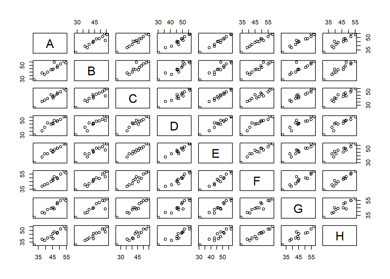
suppressMessages(library(GGally))
ggpairs(data = oat_data2,columns = 1:8)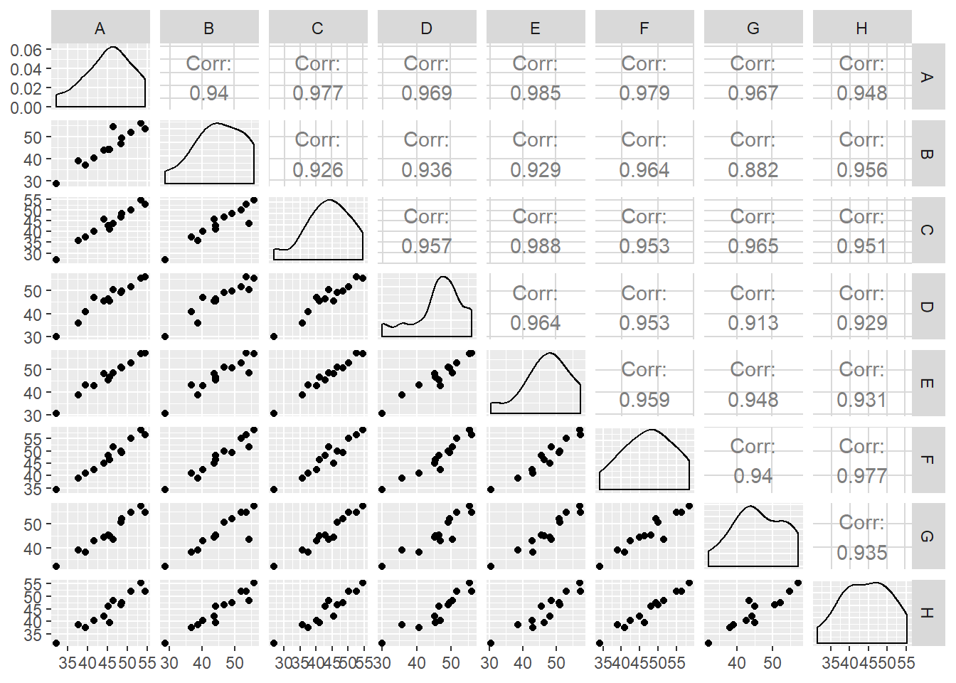
Since the means and variances of the yields of 8 varieties are not much different, we can use the covariance matrix to obtain principal component analysis. However, it is advisable to scale (standardized) the variables if you expect to visualize principal components using a biplot since the vectors representing the varieties should be of unit length. You can use the functions prcomp() and princomp to compute the principal components in R. The difference between the two is simply the method employed to calculate PCA. To get help from R just type ?princomp in the console.
pr.out <- prcomp(oat_data2, scale=TRUE)
#loadings of the principal components
kable(pr.out$rotation) | PC1 | PC2 | PC3 | PC4 | PC5 | PC6 | PC7 | PC8 | |
|---|---|---|---|---|---|---|---|---|
| A | 0.3586163 | 0.1653196 | 0.1058518 | -0.2486012 | 0.4066296 | -0.0227407 | -0.7056197 | -0.3275557 |
| B | 0.3478702 | -0.6368095 | 0.0545720 | 0.3647403 | 0.2813617 | 0.5059168 | 0.0424513 | 0.0229796 |
| C | 0.3563794 | 0.2848707 | 0.0601137 | 0.5252810 | -0.3239142 | -0.0781449 | 0.1708394 | -0.6099964 |
| D | 0.3519441 | -0.0483905 | 0.5967907 | -0.4777262 | -0.4690630 | 0.2250698 | 0.1099749 | 0.0814948 |
| E | 0.3558807 | 0.2446484 | 0.3314327 | 0.3693313 | 0.2109387 | -0.3845326 | 0.0075329 | 0.6122301 |
| F | 0.3566816 | -0.2342416 | -0.1696205 | -0.3765736 | 0.3246585 | -0.4661009 | 0.5313093 | -0.2058825 |
| G | 0.3486915 | 0.5236906 | -0.4756094 | -0.1509746 | 0.0861847 | 0.5037623 | 0.2127402 | 0.2206854 |
| H | 0.3522090 | -0.3076952 | -0.5110983 | -0.0036162 | -0.5227059 | -0.2605306 | -0.3625099 | 0.2180065 |
The above values are called loadings of the principal components. The values for PC1 have the same sign and the values are approximately equal. Therefore, PC1 can be considered as some kind of average of the measurements of all varieties. However, PC2 has a negative weight for ‘B’, ‘D’, ‘F’, ‘H’, and positive weights for other varieties. These groupings indicate the differences and similarities between the the yields of 8 varieties.
Now we try to calculate the proportion of variance explained by each PC, since it is important to identify the number of principal components that we can retain further.
summary(pr.out)## Importance of components:
## PC1 PC2 PC3 PC4 PC5 PC6
## Standard deviation 2.7668 0.38378 0.30914 0.1959 0.18349 0.15048
## Proportion of Variance 0.9569 0.01841 0.01195 0.0048 0.00421 0.00283
## Cumulative Proportion 0.9569 0.97534 0.98728 0.9921 0.99629 0.99912
## PC7 PC8
## Standard deviation 0.06536 0.05265
## Proportion of Variance 0.00053 0.00035
## Cumulative Proportion 0.99965 1.00000Note that the proportion of variance of the first principal component explains 95.69% of the variance of the data, and the contribution of the other principal components is very less. Hence, the first PC is sufficient to explain the variation of the data. This infromation can be shown visually by using the following graph.
pr.var <- pr.out$sdev^2
pve <- pr.var / sum(pr.var)
plot(pve, xlab='Principal Component',
     ylab='Proportion of Variance Explained',
     ylim=c(0,1),
     type='b')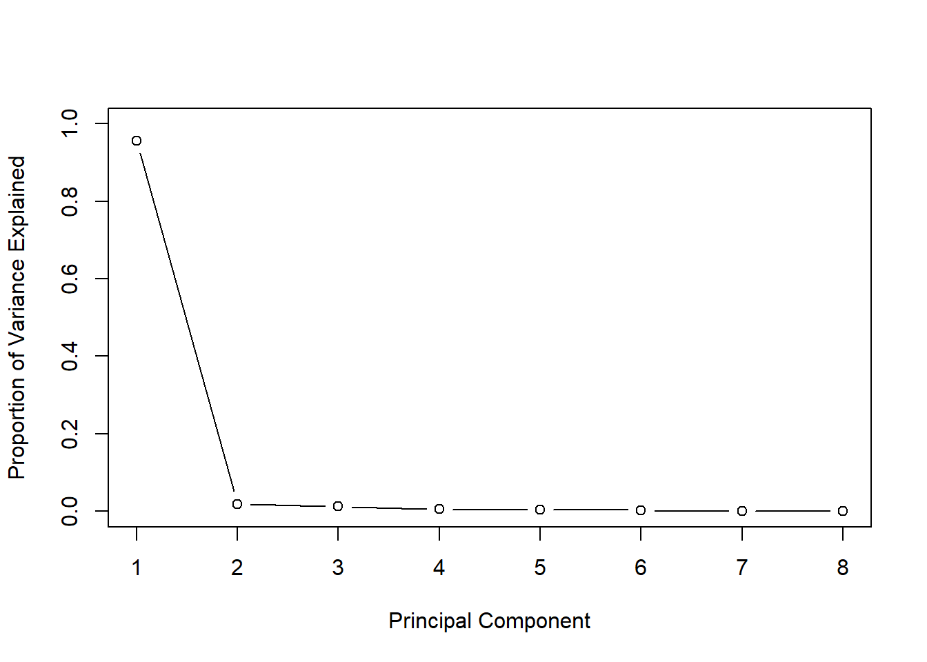
Check the steepness of the graph.
In this case the non-steep of the graph can be seen after the second point. This indicates that one principal component is sufficient to represent data.
For this data set we noted that the first PC is sufficient to explain the variation of the data based on the proportion of variance of the principal components. There are some other methods to identify the number of principal components. Jolliffe (1972) suggested the cutoff value as 0.7 if one uses correlation matrix for the analysis, and 0.7(average eigenvalue) if one uses covariance matrix for the analysis.
Cattell (1966) proposed to draw a ‘Scree plot’. A scree graph of the eigenvalues can be plotted to visualize the proportion of variance explained by each subsequential eigenvalue.
R.eigen <- eigen(cor(oat_data2))
R.eigen
## eigen() decomposition
## $values
## [1] 7.655402309 0.147290913 0.095564567 0.038383280 0.033669986 0.022644515
## [7] 0.004272079 0.002772350
##
## $vectors
## [,1] [,2] [,3] [,4] [,5]
## [1,] -0.3586163 -0.16531956 0.10585183 -0.248601164 -0.40662957
## [2,] -0.3478702 0.63680952 0.05457202 0.364740256 -0.28136171
## [3,] -0.3563794 -0.28487066 0.06011366 0.525280968 0.32391418
## [4,] -0.3519441 0.04839045 0.59679066 -0.477726156 0.46906295
## [5,] -0.3558807 -0.24464835 0.33143268 0.369331258 -0.21093871
## [6,] -0.3566816 0.23424160 -0.16962051 -0.376573557 -0.32465852
## [7,] -0.3486915 -0.52369064 -0.47560939 -0.150974608 -0.08618469
## [8,] -0.3522090 0.30769518 -0.51109834 -0.003616206 0.52270587
## [,6] [,7] [,8]
## [1,] 0.02274072 0.705619689 -0.32755571
## [2,] -0.50591683 -0.042451345 0.02297964
## [3,] 0.07814495 -0.170839351 -0.60999639
## [4,] -0.22506977 -0.109974925 0.08149479
## [5,] 0.38453259 -0.007532911 0.61223009
## [6,] 0.46610086 -0.531309308 -0.20588248
## [7,] -0.50376231 -0.212740185 0.22068544
## [8,] 0.26053062 0.362509942 0.21800652plot(R.eigen$values, xlab = 'Eigenvalue Number', ylab = 'Size of the Eigenvalue', main = 'Scree Graph')
lines(R.eigen$values)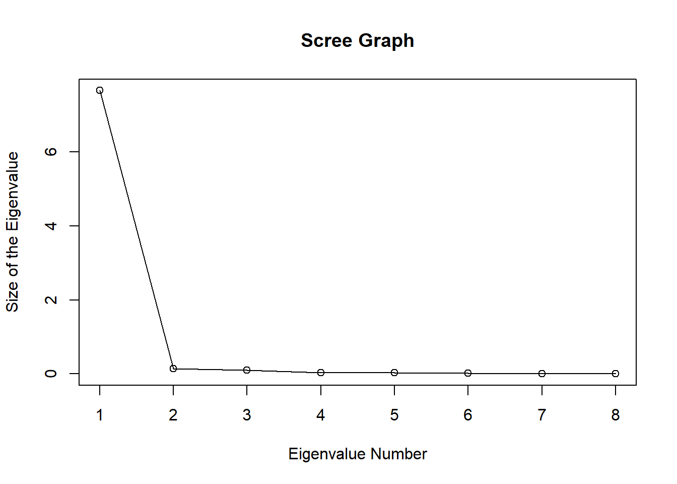
According to Jolliffe’s method only one eigen value is greater than 0.7. Also check the steepness of the graph.
In this case the non-steep of the graph can be seen after the second eigen value. This indicates that one principal component is sufficient to represent data.
Visualization of Principal Components
The first two principal components are often plotted as a scatter plot which may reveal interesting features of the data. To show the spread of the data and principal components, we can draw a biplot. Biplot is a multivariate scatter plot.
#biplot
biplot(pr.out, scale=0)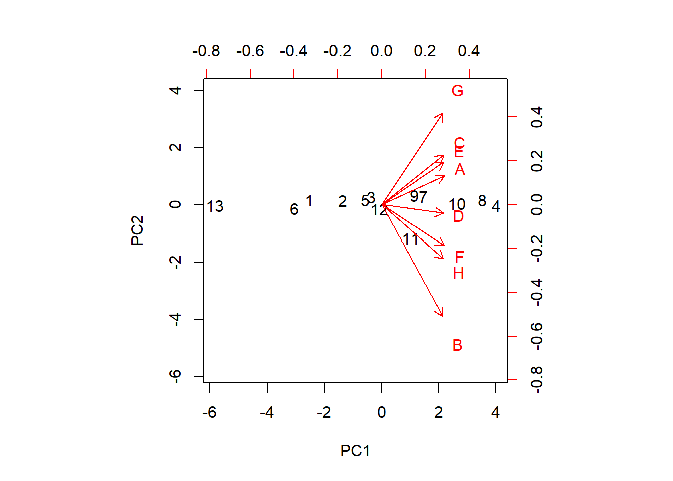
The parameter scale = 0 ensures that arrows are scaled to represent the loadings. Although the loadings of the principal components of the first two PC’s indicate two clear groupings as {A, E, C, G} and {B, D, F, H}, further grouping is also visible. So we identify fiver grouping of yield as {B}, {D}, {F, H}, {A,E,C} and {G}. Further, the yields of the varieties F and H are very similar, and C and E are very similar. The arrows show how the variables are moving across the two dimensions. We can see that the three varieties B, F and H are moving along the first PC while the other varieties except D moves mostly across the second PC. The locations colored in black show how each location varies across the PC directions. For example, location 11 (Garbno) is mostly associated with the variety B.
Since the angles between the standardized variables are all acute, it indicates that the variables are positively correlated.
The ggfortify package provides a nice scatter plot for the first two principal components with autoplot() function.
library(ggfortify)
pca.plot <- autoplot(pr.out, data = oat_data,colour = 'location')
pca.plot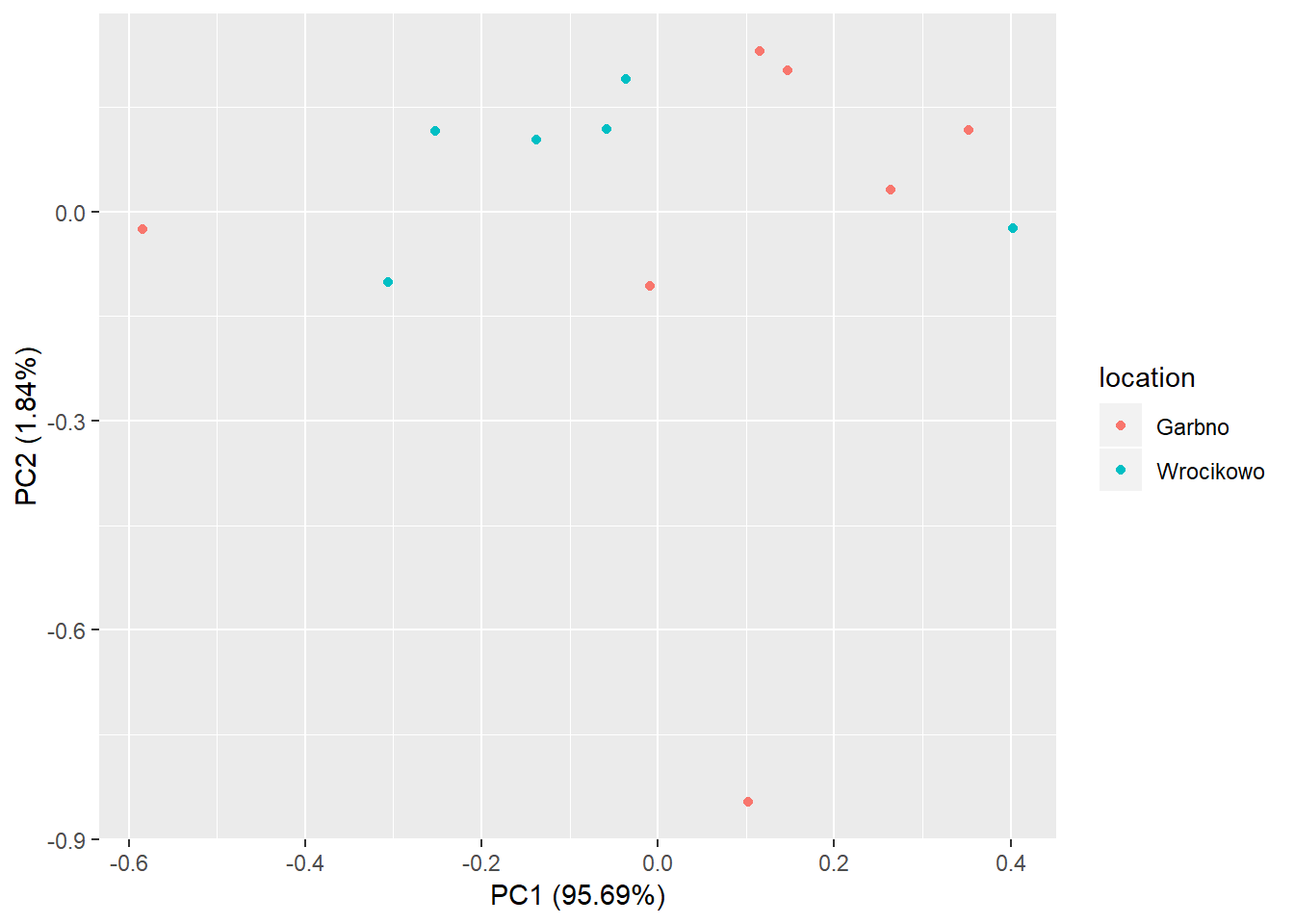
The points of the two groups are clustered for most of the part. However, the two points at the bottom and left of the graph may be outliers.
What are the conclusions?
One variable to represent yields of all varieties
| PC1 | PC2 | PC3 | PC4 | PC5 | PC6 | PC7 | PC8 | |
|---|---|---|---|---|---|---|---|---|
| A | 0.3586163 | 0.1653196 | 0.1058518 | -0.2486012 | 0.4066296 | -0.0227407 | -0.7056197 | -0.3275557 |
| B | 0.3478702 | -0.6368095 | 0.0545720 | 0.3647403 | 0.2813617 | 0.5059168 | 0.0424513 | 0.0229796 |
| C | 0.3563794 | 0.2848707 | 0.0601137 | 0.5252810 | -0.3239142 | -0.0781449 | 0.1708394 | -0.6099964 |
| D | 0.3519441 | -0.0483905 | 0.5967907 | -0.4777262 | -0.4690630 | 0.2250698 | 0.1099749 | 0.0814948 |
| E | 0.3558807 | 0.2446484 | 0.3314327 | 0.3693313 | 0.2109387 | -0.3845326 | 0.0075329 | 0.6122301 |
| F | 0.3566816 | -0.2342416 | -0.1696205 | -0.3765736 | 0.3246585 | -0.4661009 | 0.5313093 | -0.2058825 |
| G | 0.3486915 | 0.5236906 | -0.4756094 | -0.1509746 | 0.0861847 | 0.5037623 | 0.2127402 | 0.2206854 |
| H | 0.3522090 | -0.3076952 | -0.5110983 | -0.0036162 | -0.5227059 | -0.2605306 | -0.3625099 | 0.2180065 |
Yields of 8 varieties are in five different groups Variances of the yields are mostly similar
Further details:
1. https://rpubs.com/Buczman/PCAPokemon
2. http://www.rpubs.com/aaronsc32/principal-component-analysis
3. https://rpubs.com/ryankelly/pca
4. https://rpubs.com/JanpuHou/278584
Reading data in different formats: http://www.sthda.com/english/wiki/reading-data-from-txt-csv-files-r-base-functions